
6 trends in web design that you should know
Alicja MasiukiewiczReading Time: 3 minutes
Fashion is everywhere so is in web design. We can easily point out the trends from the 90s (beloved gifs) but we can see how the trends are changing in front of our eyes. These days everyone can create a website. Thanks to the platforms like WordPress you don’t have to be professional to run your own page, blog or even store, thanks to the wide range of templates you can be sure your page will be both good looking and easy to use. But technology is changing, so as our needs - the way we use the Internet - it all become very challenging and users are more demanding than ever before and this is why we need professionals, to create trends others can follow.
Let’s take a pick what is so trendy nowadays.
1. Flat Design
Flat design is working for a quite long time now and it seems to be a natural continuation of responsive design. It’s scalable, often in bright, contrast colours - thanks to its simplicity it’s much easier to focus on the usability of a site or an application. Once is well designed you can lead the visitor with ease across your page. Very often the grid of a website is noticeable which gives you the feel of clean and ordered structure even when you use colourful and playful elements.
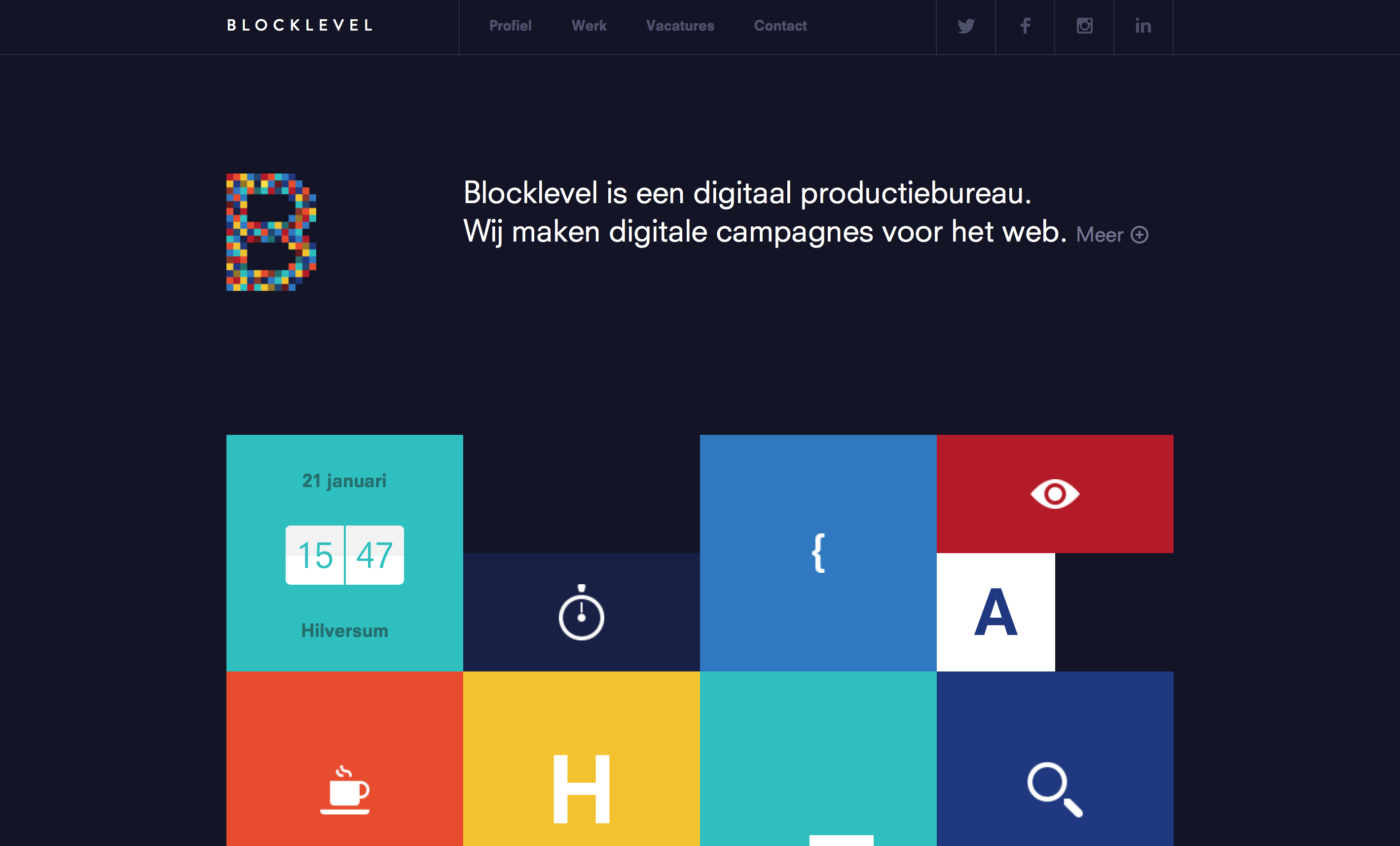 Source: http://www.blocklevel.nl
2. Material Design
On the other hand, Material Design is, or for some supposed to be, improved a flat design. It’s a trend started, developed and promoted by Google. Material design it’s a concept based on how real materials behaves and responds to a human touch. It uses a grid based layout but in this case, all x, y and z dimensions to provide the feel of the depth to any object, element of the layout by using light and shadow effects.
Although Google provides a guide with loads of principals and rules how to create the material design is’s far from being stiff and boring. All in all material design merges principals of good classic design and possibilities given by constantly innovating technology.
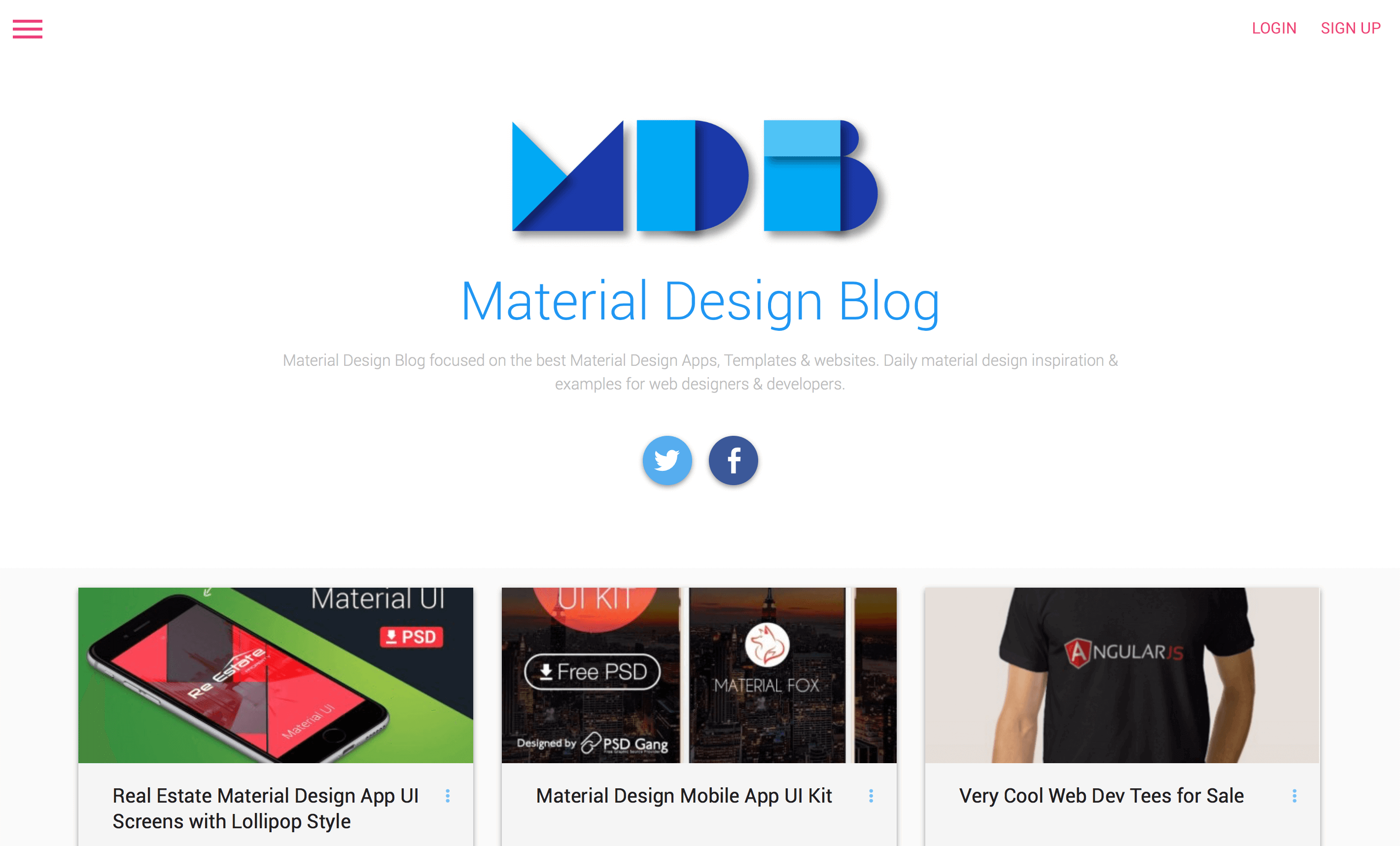 Source: http://materialdesignblog.com
3. Tile-style Design
We may argue if it’s a dying trend or current trend but it’s definitely revolutionary one and once it’s well used it works great. It has become popular after Pinterst appeared and I have to admit it works very good for the Pinterest. But it’s a challenging layout and it can’t be overused. The big issue is that the whole content seems to be equally relevant. Misused may generate chaos and upset a user so for all interested in tile-style design - think twice before you choose it! But don’t be scared it’s being used by the bests!
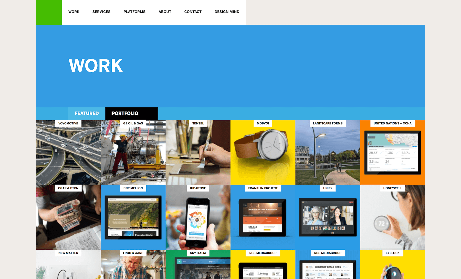 Source: http://www.frogdesign.com/work/portfolio
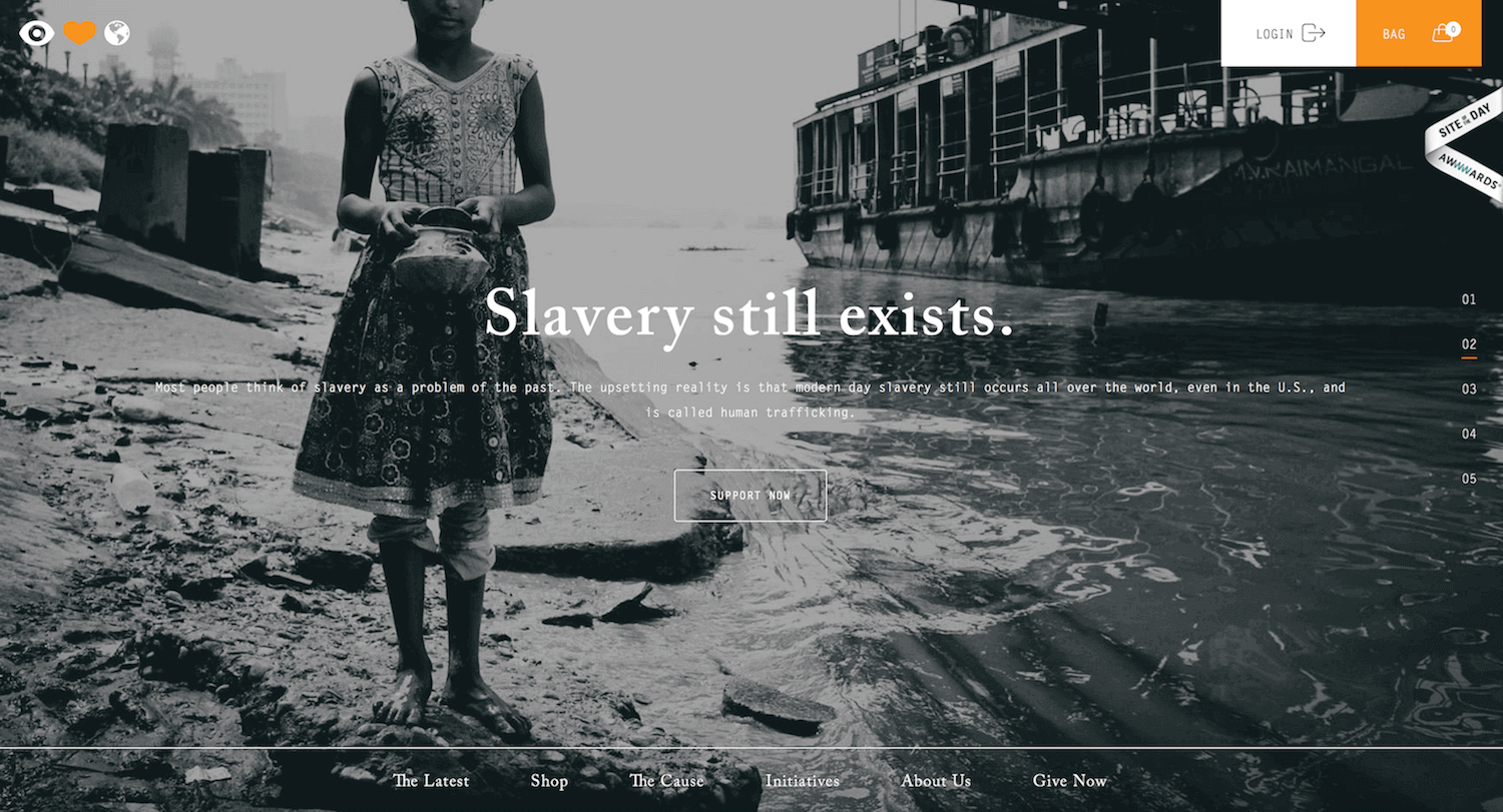
4. Full screen, active background
Do you remember websites from the 90s? Jumping, shining, singing, worst of all? Looks like we've tamed the monster. Nowadays active background with animation or slideshow can be enormously attractive. Good balance between background and content gives the feel of fresh, contemporary, brave design. It works perfectly when a website bases on good pictures. And the great news is that now we don’t really have to wait 10 minutes for the background to load (thank you dear HTML 5).
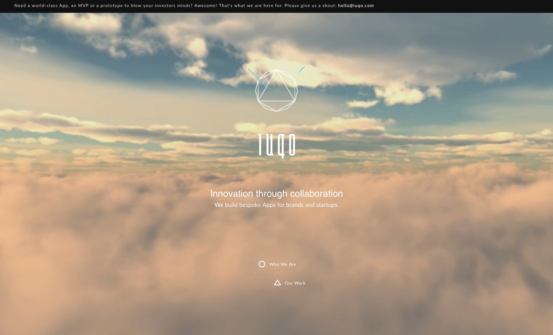 Source: http://iuqo.com
 Source: http://eyeheartworld.org
5. Mobile on desktop
It becomes more and more popular to use mobile solutions on desktop. All unnecessary icons, information are removed or hidden. We can find hamburger menu even on the biggest screen. It’s a great solution for those who love clear divisions, minimalism or those who have so much to expose that it’s better to hide what’s not in use at the moment. It can be confusing for those who are not used to the mobile design but if you’re aware who your visitors are and you know they won’t have problem with this than go ahead - you've just gained additional space on your page!
 Source: http://brianhoffdesign.com/
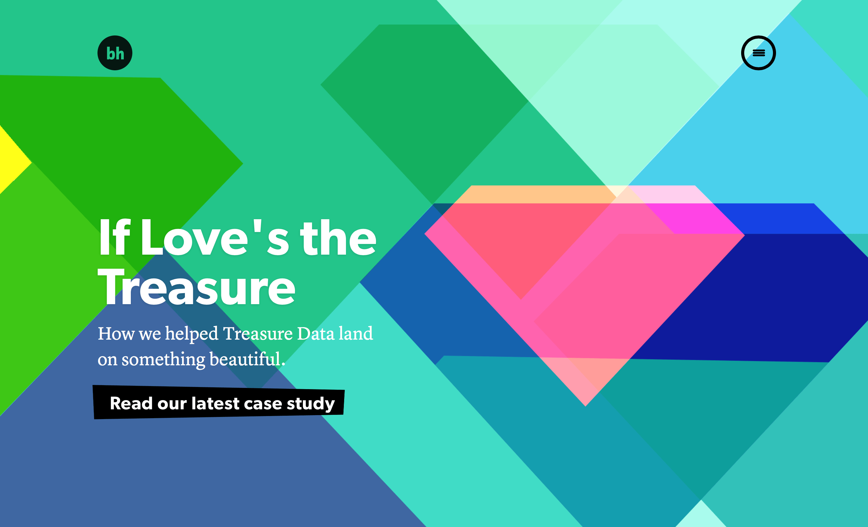
6. Single Page
Current trends eat the 'above the fold' myth up. Nowadays more and more websites are single page only but thanks to clear division on section and smart navigation scrolling is nothing scary anymore. What is more long scrolling gives great opportunity of story telling, at the same time getting rid of the complex structure of the website makes it much more easy to use.
Although this example is not exactly single-page site (forms are on the separate pages) but it’s a great example of storytelling possible thanks to the loooong scrolling.
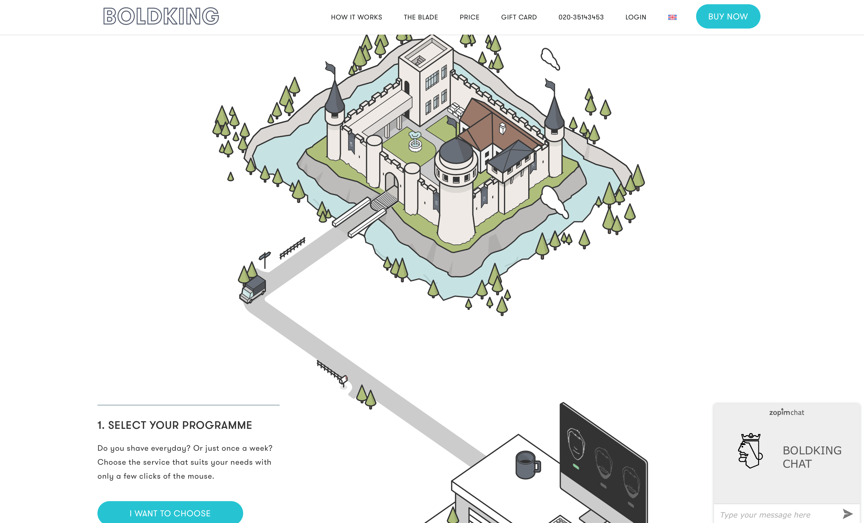 Source: https://www.boldking.com/uk
As always there are good and bad solutions for everything. Creating your own web page remember about the usability - choose the best design for you first and don’t follow fashion blindly. There is only one rule that cannot be ignored: make your website user-friendly and responsive - these are two the most important steps to your success.